Guidelines
Using the brand
Strong and consistent branding helps organizations to shape how people relate to and think and feel about them. This document provides background, context, and rules of use to help ensure consistency across all communications materials developed for/by STARS. These guidelines ensure we reach our audience with a unified voice that speaks to our values and mission.
Logo
Primary Logo
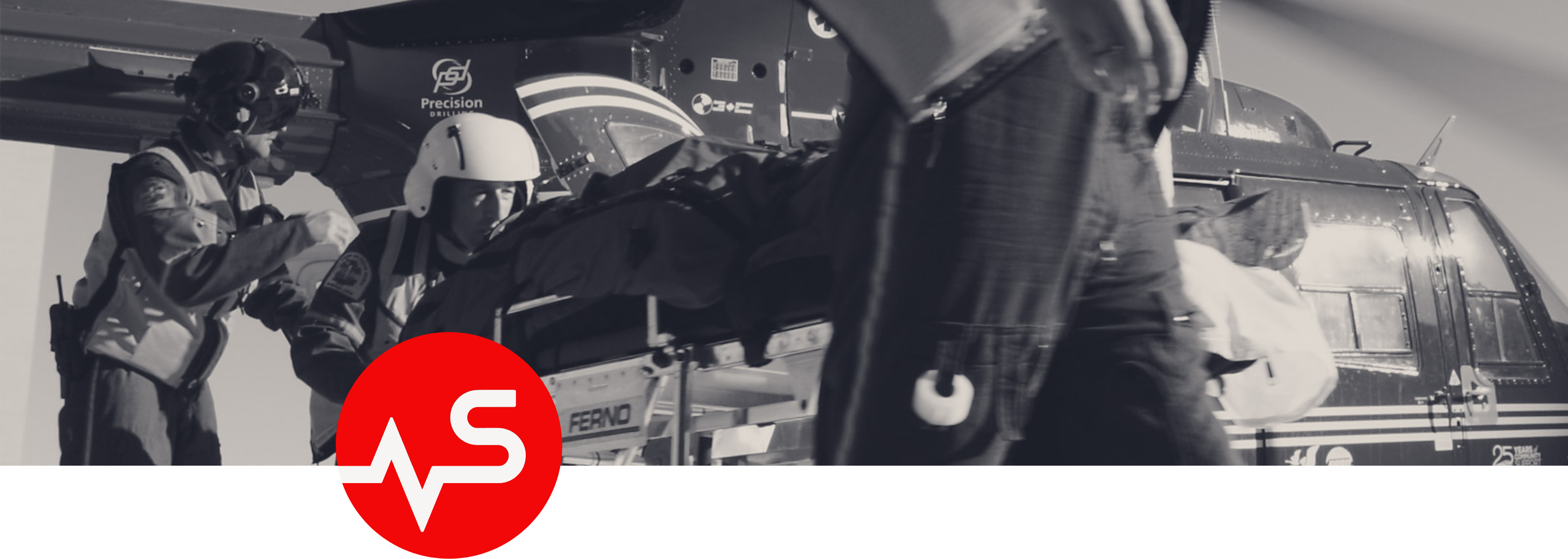
The primary logo is comprised of two elements: The wordmark and a graphic extension. The logo leads with a heart beat. A medical sign of life and hope. The heart beat also references STARS dedication to critical care and the patients they care for.
The primary logo shouldn’t be altered in any way that isn’t included in these guidelines.

Primary Logo Colours

Secondary Logo
The secondary logo can be used in instances where a smaller logo is needed or for applications such as icons or avatars.
Clear Space
The logo should be protected from other graphic material with clear space. No material other than a background should appear within this clear space.

Minimum sizing
Recommended minimum sizes have been set to ensure legibility and maximum impact of STARS logos on all communications materials.

In Support Of STARS Lockup
The In Support Of STARS lockups are intended for use by third party event promoters who wish to include the STARS logo in their promo materials. It is available in three versions for flexibility: Red logo on white background, white logo on red background and black logo on white background. We’ve created a handy guide for the use of these assets as well.

STARS Vigilant
STARS Vigilant Logo
The STARS Vigilant Logo is the primary identity for the Vigilant brand. It shouldn’t be altered in any way. For more guidance on using the this identity, please reach out to the Vigilant team.
Colours
Critical Care Red
RGB: 242 8 8
CMYK: 0 100 100 0
HEX # f20808
Hopeful Blue
RGB: 145 222 207
CMYK: 45 0 27 0
HEX # 91decf
Midnight Blue
RGB: 12 46 63
CMYK: 100 46 0 89
HEX # 0c2e3f
Saving Grey
RGB: 224 217 209
CMYK: 5 8 10 16
HEX # e0d9d1
Misty White - Digital use only
RGB: 246 244 243
HEX # f6f4f3
Typography
Rubik

Rubik is our primary corporate typeface for headlines and body copy and should be used for all STARS materials whenever possible.

Brand Design elements
Pathway to Help & Health


Social Avatars


Photography
Primary Photography
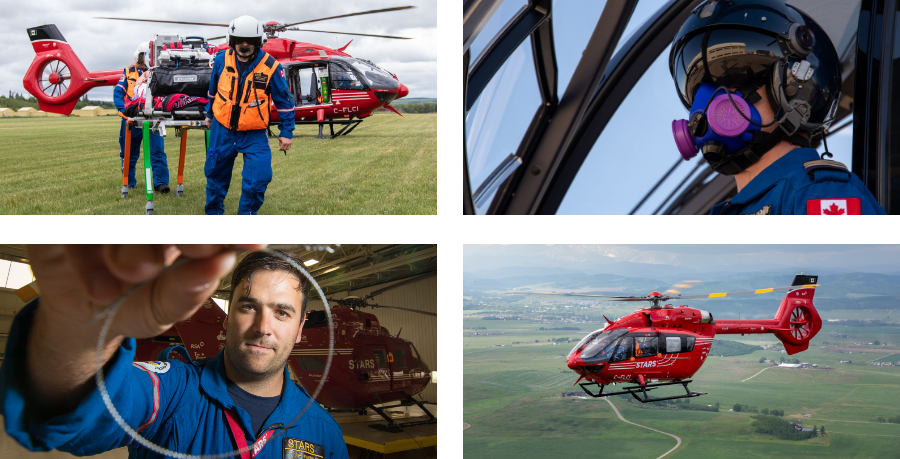
Hero or main images should be used in full colour.
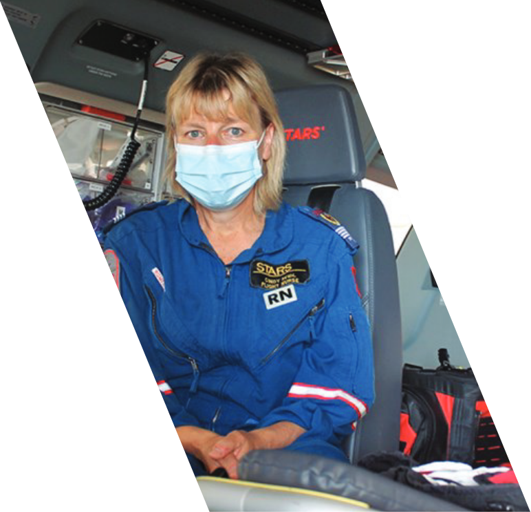
An angled frame can be used. This angle is taken directly from the logo mark.

Secondary Photography
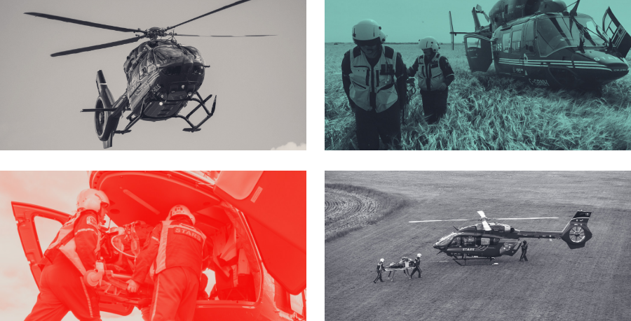
Secondary photography can be used as background or to add texture. These are not hero or portrait images. They are used as brand elements.